
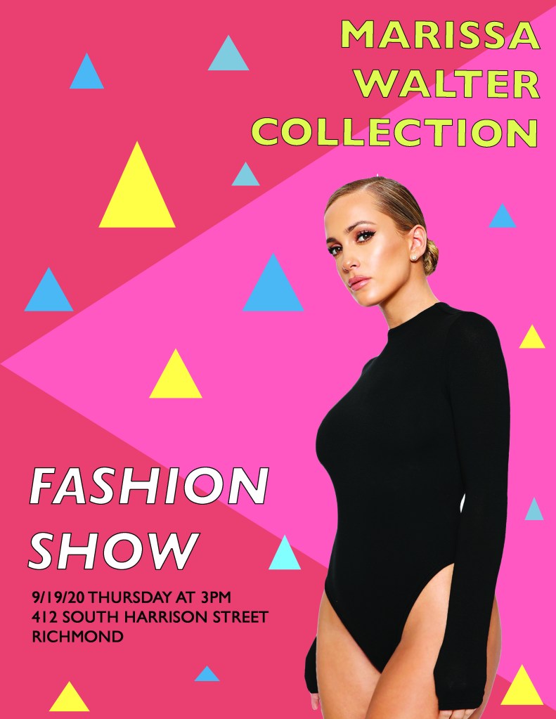

Proximity: I grouped the location, time, and date together in the lower left corner to show that they all go together in the sense of direction and also, to organize my poster.
Alignment: I aligned the bottom two text boxes to the left because they were on the left side of the poster and I though it made it look more uniform. I aligned the top right text box to the right because it was on the right of the poster and I wanted it to stand out since it was the name of the designer.
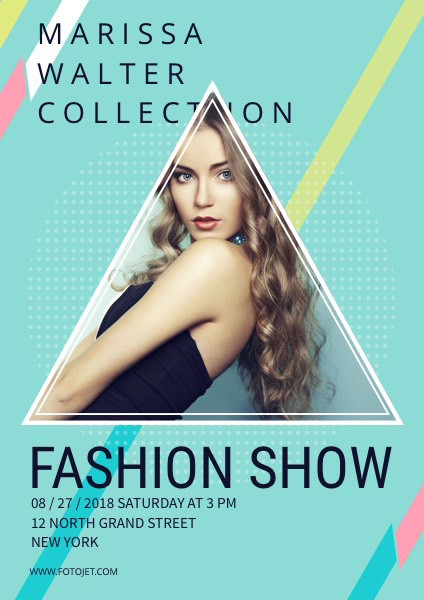
Repetition: I really wanted to focus on the primary colors since those were the colors used in the original poster. I repeated the stroke on the outlining of the letters in “FASHION SHOW’ and “MARISSA WALTER COLLECTION” to make it stand out more as well as the type of font. I repeated the triangles all around the page of all different sizes to give the poster some dimension. Lastly, I repeated the color of the models bodysuit to mimic the stroke color and location, date, and time text.
Contrast: I wanted to make sure I repeated the same primary hues but also add a few tints to give it contrast. I like how the black bodysuit is very contrasted against the red tinted background and allows it to stand out more.

